Framed App Design
No 1 About
An App for Avid Admirers of the Arts
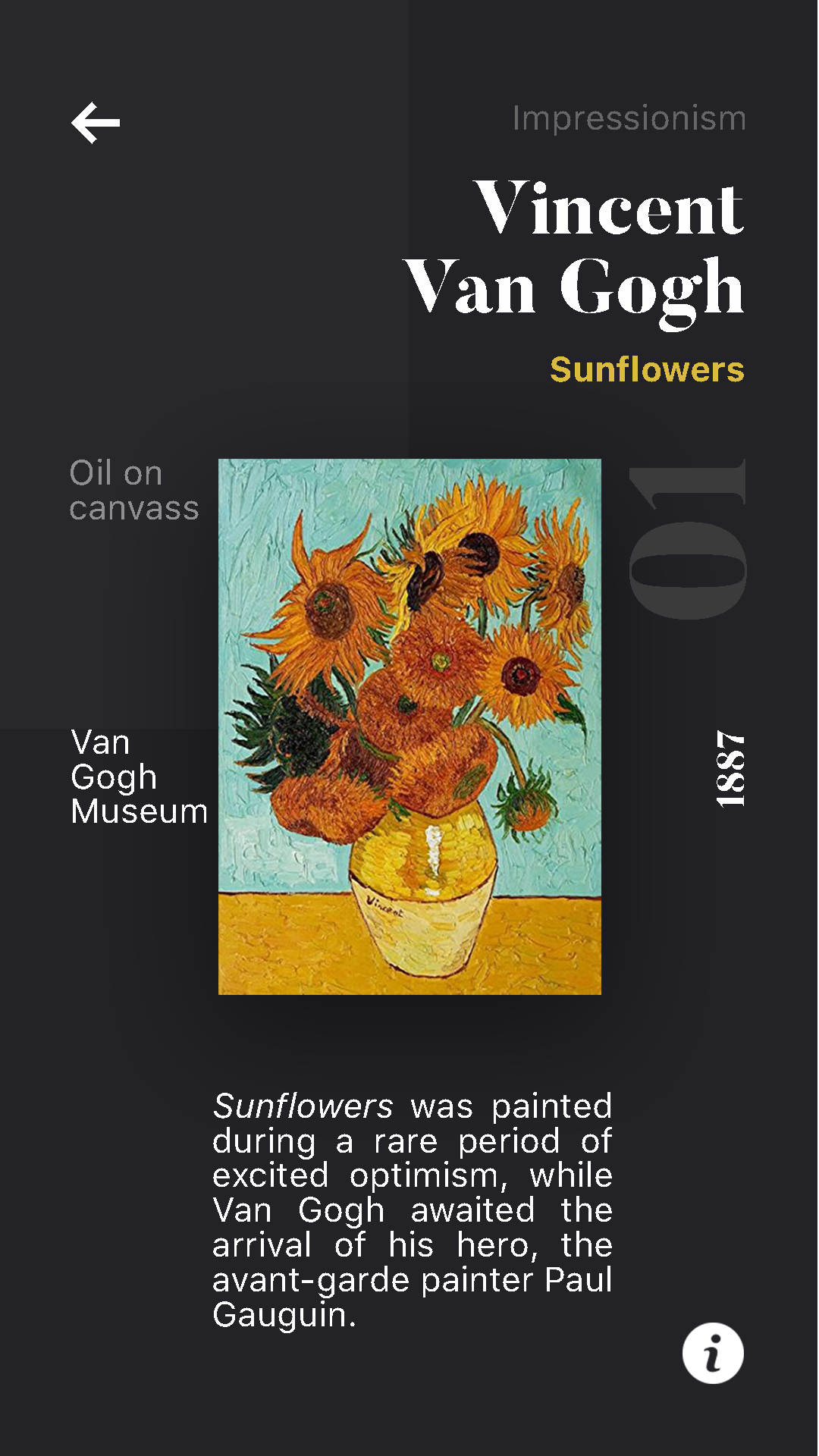
Framed is a personal project created for the average museum-goer to digitally collect and curate artwork that they’ve seen. Users can scan a QR code posted near the work to add it to their digital collection, along with relevant information about the piece. Then they can create their own galleries of works they’ve saved, or work to complete precurated categories of collections.
No 2 Gallery
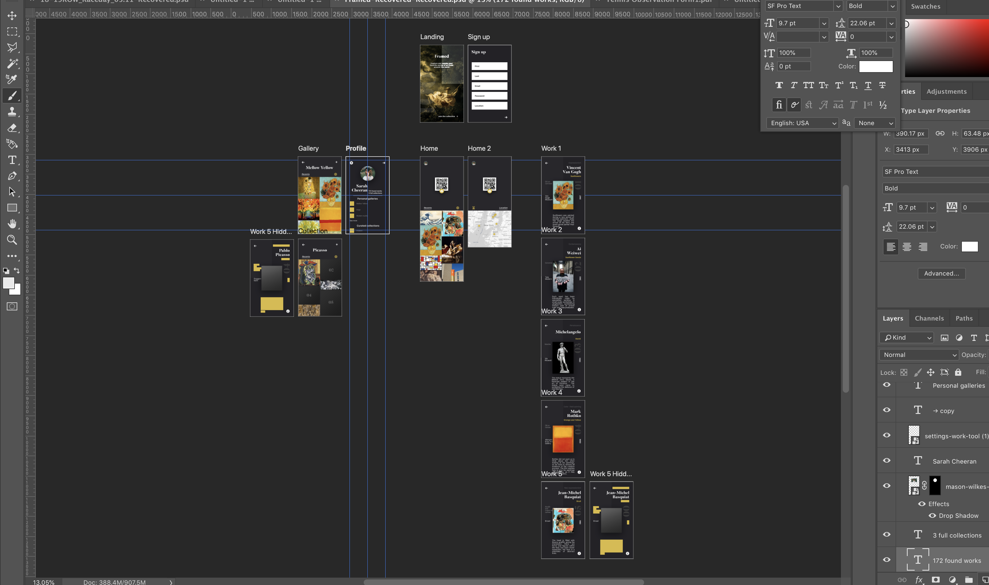
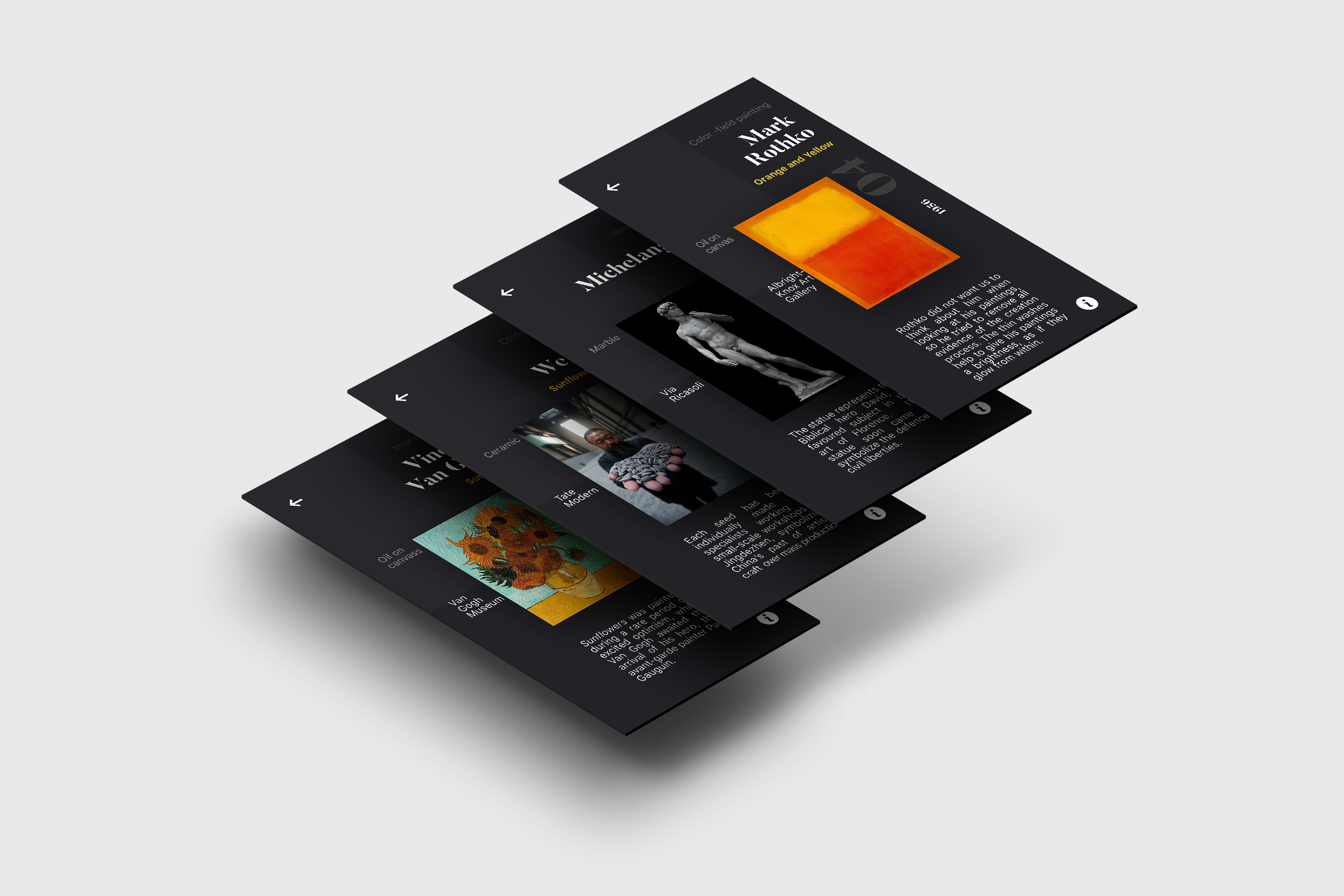
Scroll through the screens
No 3 Intent
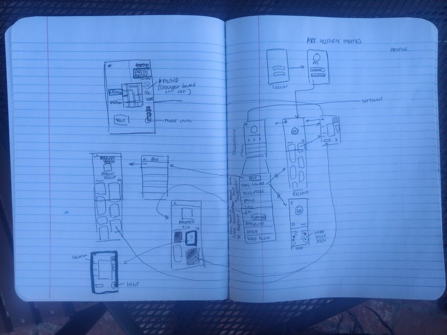
Framed started as an organic exploration of the beginning of the design process.
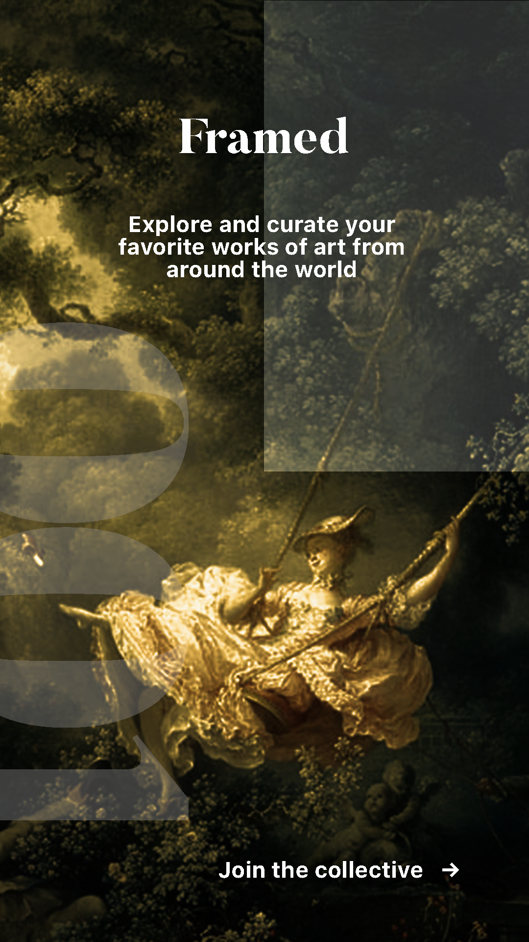
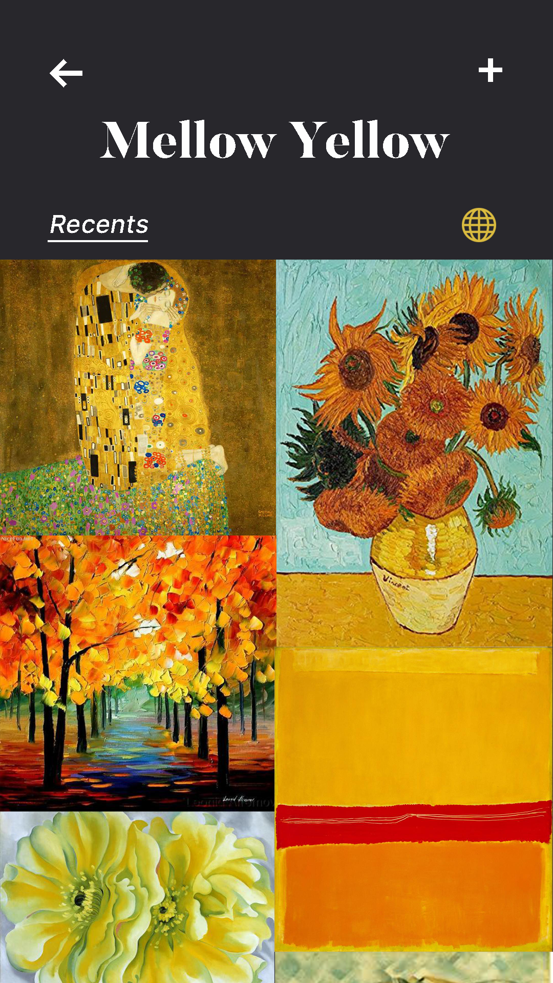
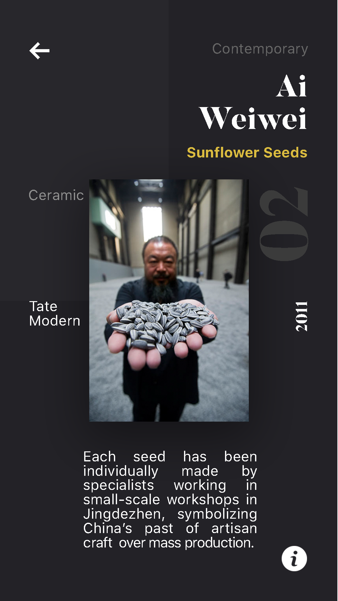
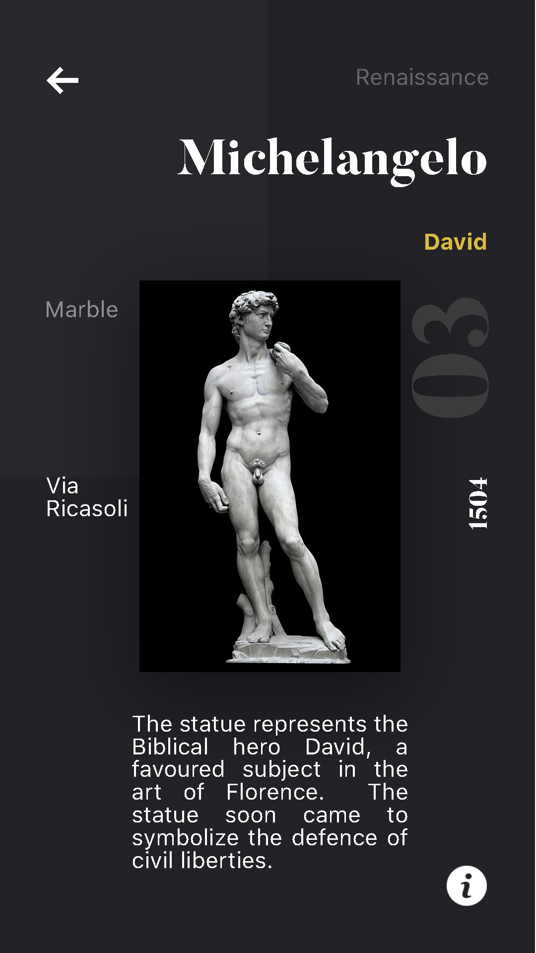
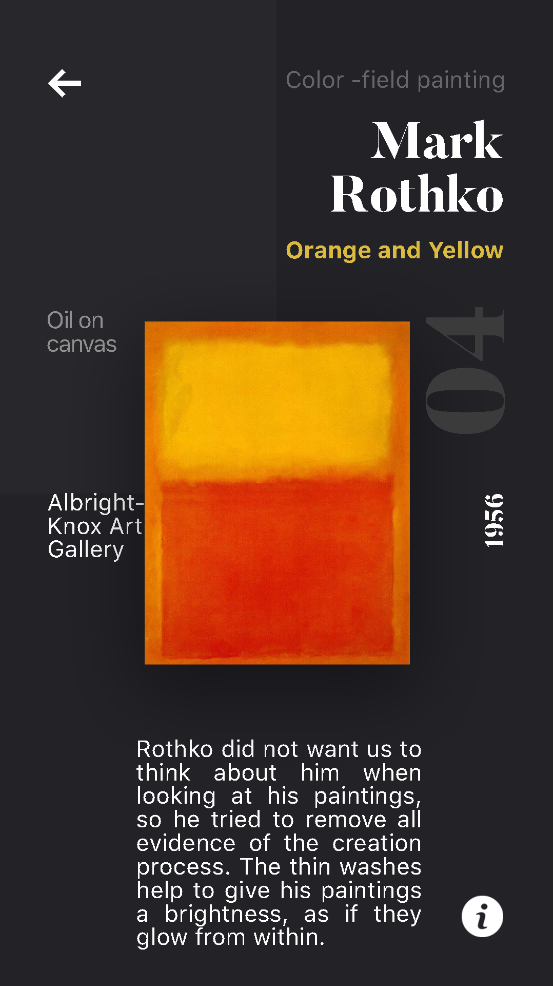
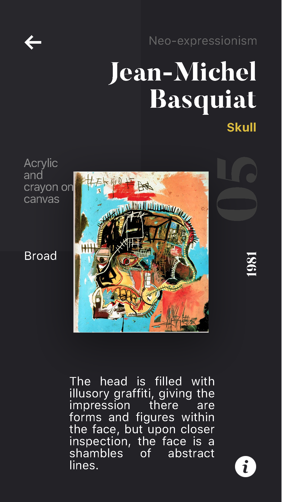
Framed demonstrates the very beginning of the UX design process. I wanted to experiment with building from scratch and instinctive creation. The concept of collecting and sorting visual information isn't very common in popular apps, so I took the opportunity to prototype organically, without the influence of familiar designs. The two main actions are scanning a work and viewing your saved works. The landing page of the app contains both, where the majority of the screen is a button to access the QR scanner. The records of saved works are housed right below it with two different displays optioned by a non-traditional toggle button. The display of the works strays from convention in layout, but the information shown still follows a hierarchy through opacity, with features like the artist's name brighter than the medium.
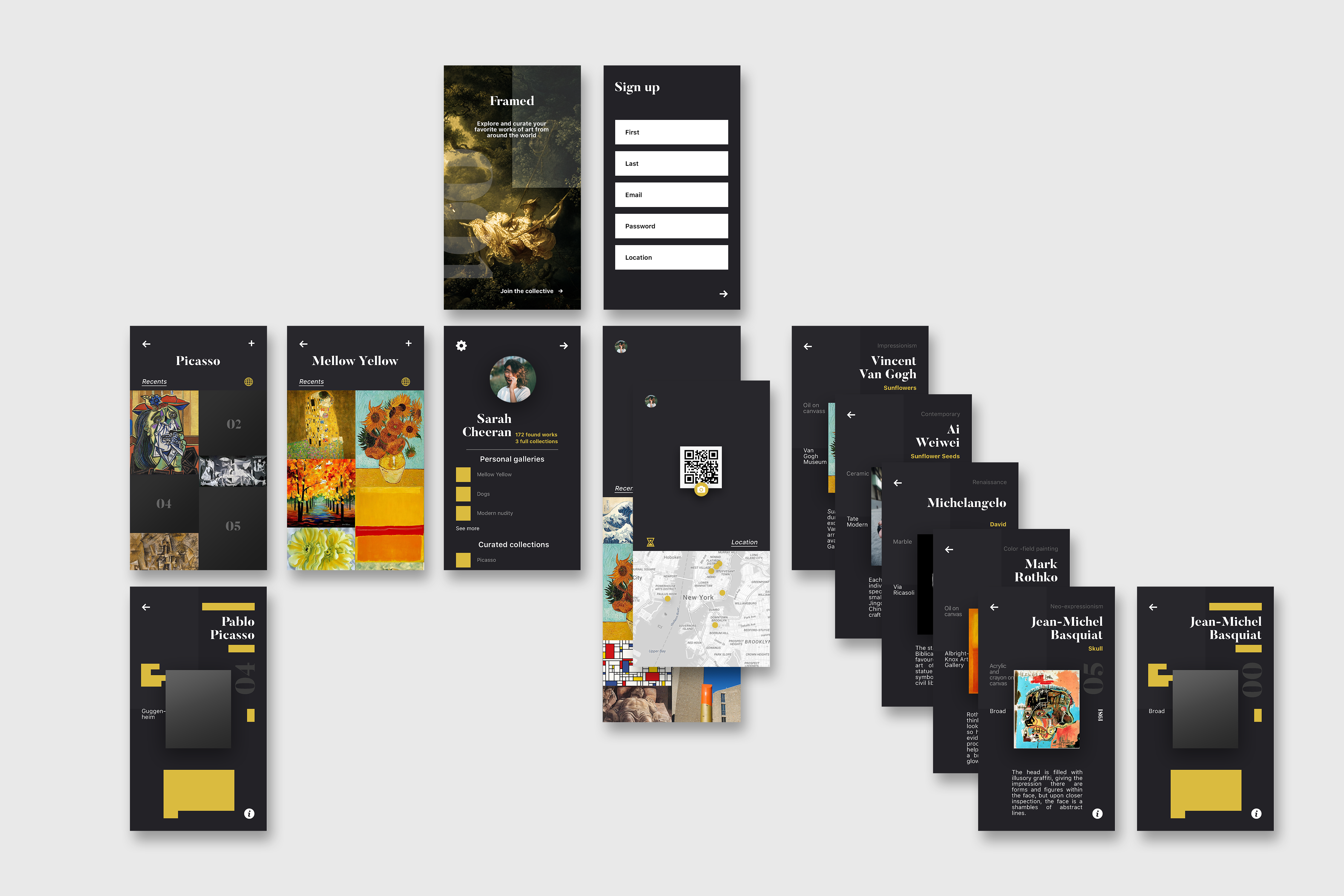
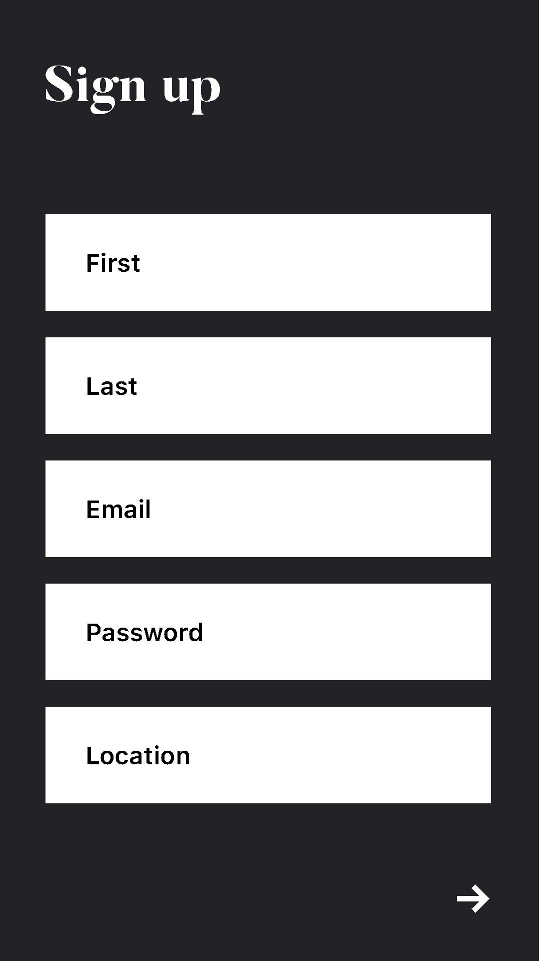
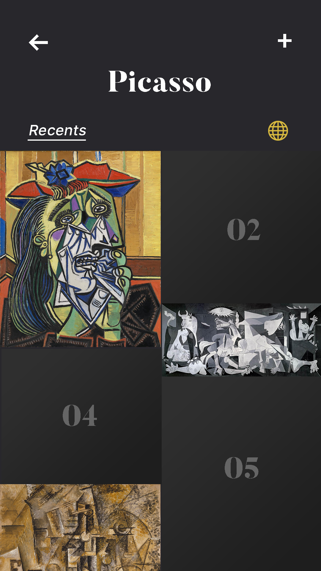
1. Landing page is an exaggeration of Framed's UI 2. Sign-up includes location to suggest nearby museums 3. Works that have yet to be found are blurred, and the only displayed information is the artist name and work location 4. Homepage lets you toggle seen works between recents and location
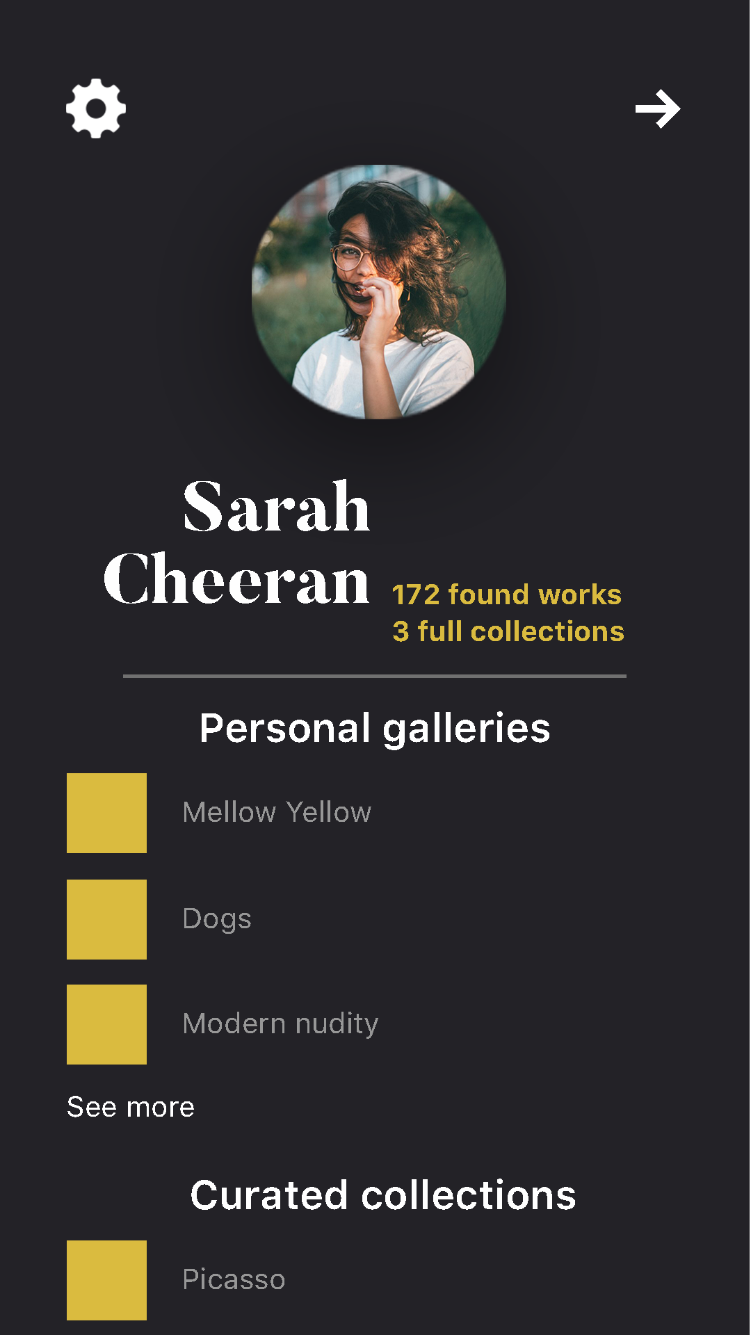
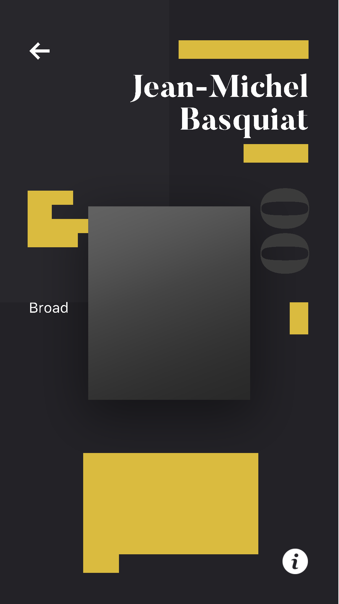
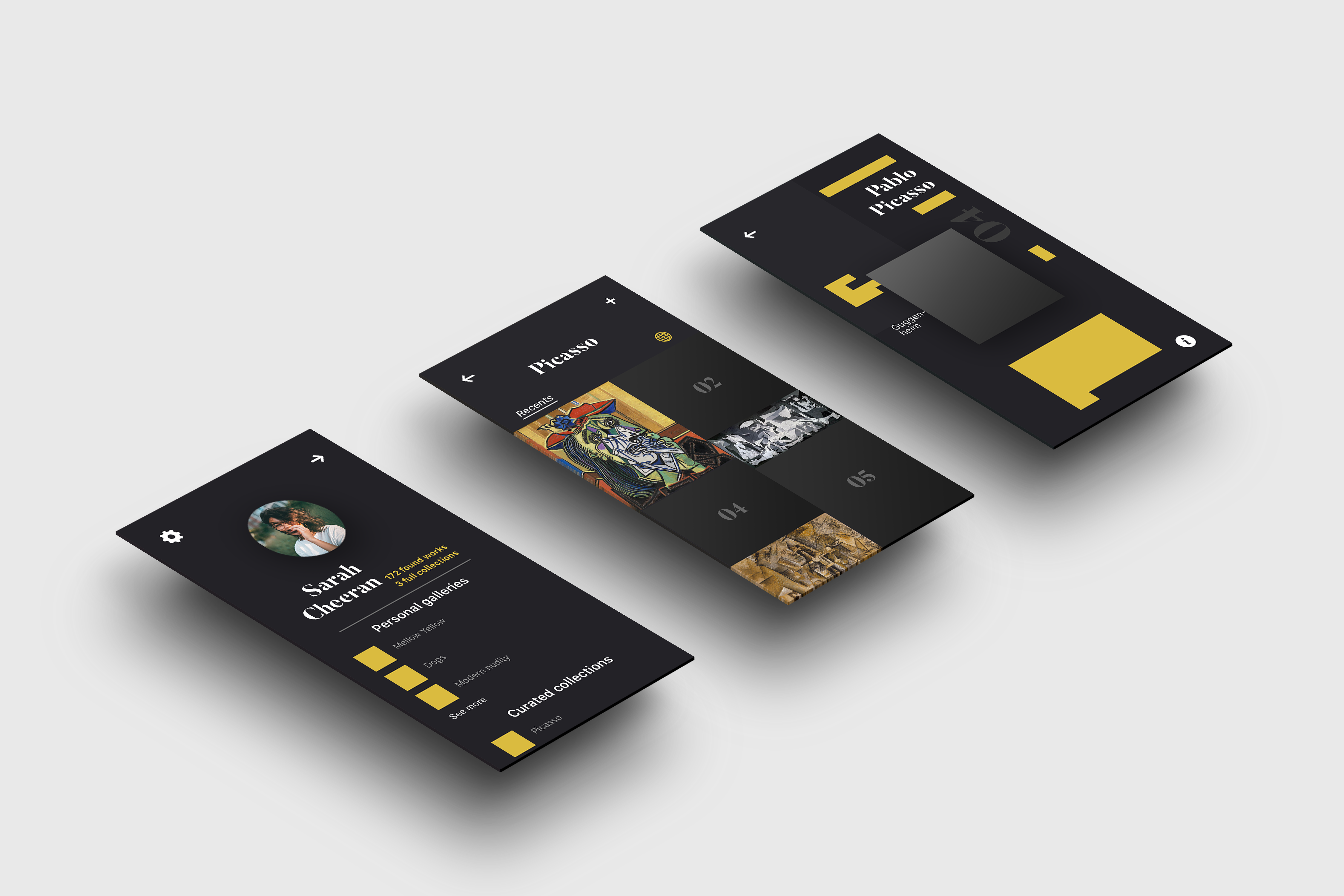
On the top left of the home page is access to the profile. This doesn't house as much user information as it does user interaction with the works. It displays the personal galleries and created collections up to the third most recent followed by a "see more" to avoid clutter and unnecessary visuals. When a piece in a curated collection hasn't been saved by the user, I have chosen to leave most of the information blacked out. I want it to be somewhat like a scavenger hunt, where the user is only told the artist name and the location of the work, encouraging them to visit the museum so they can find it in order to complete the collection.
No 4 The Process
