Enthusiast App Design
No 1 About
For the true fanatics
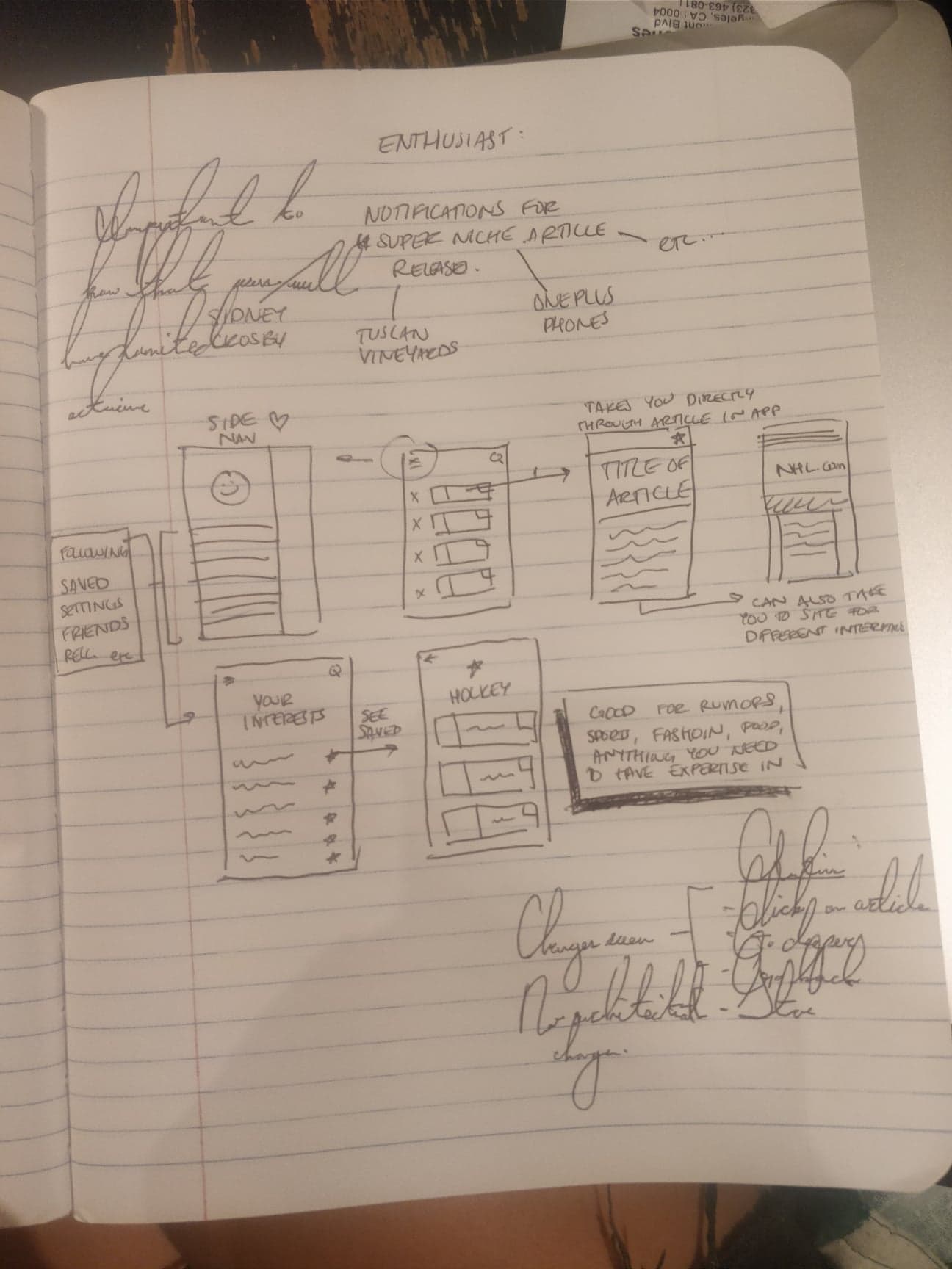
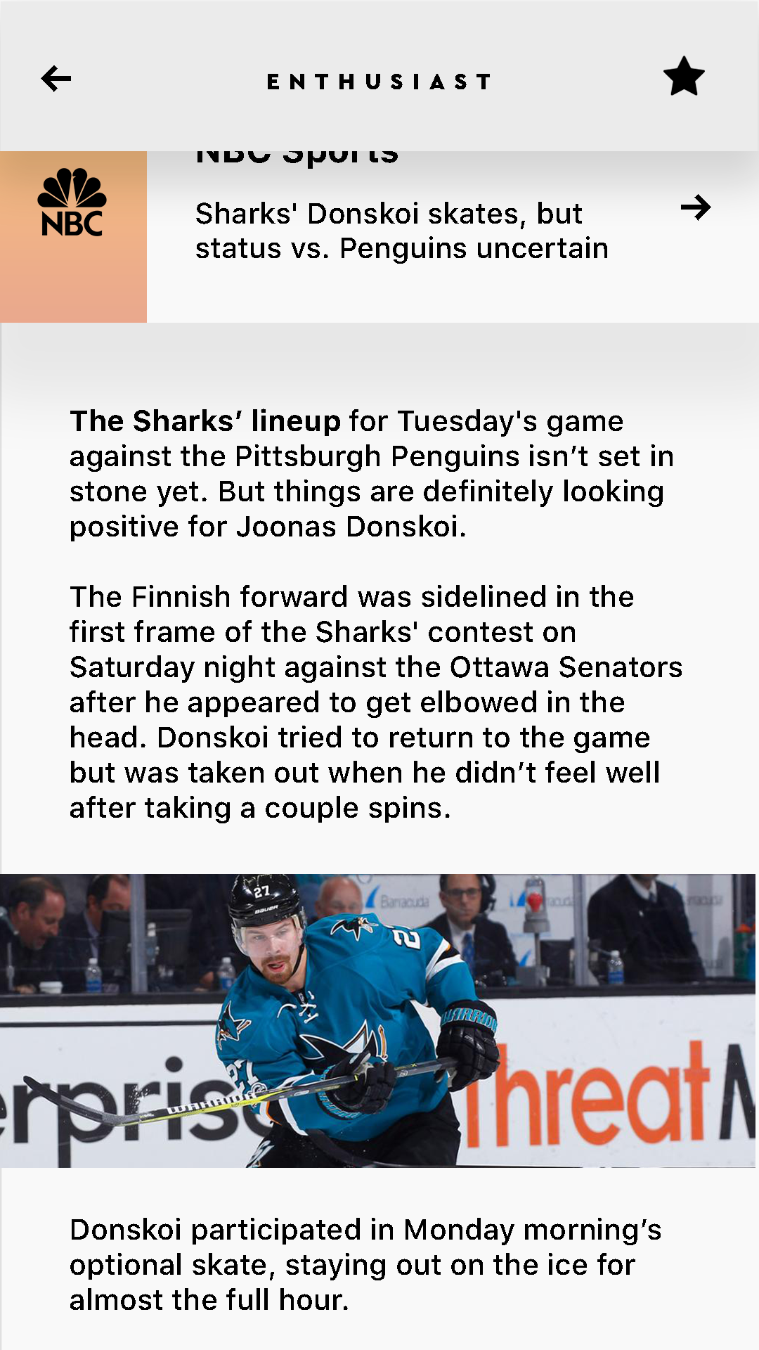
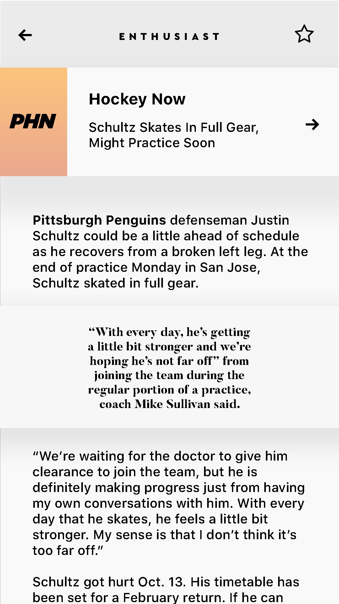
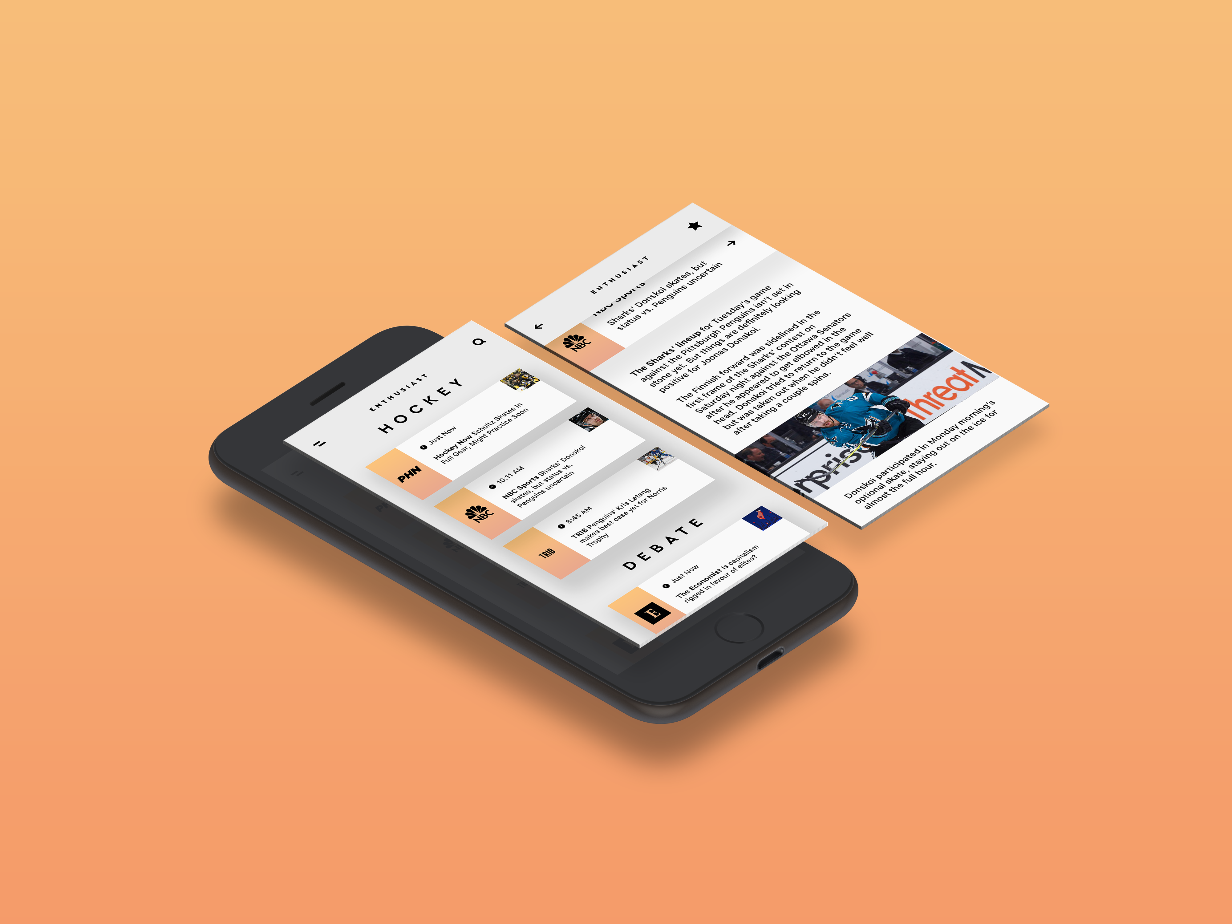
Enthusiast is a personal project created for true fanatics of hyperspecific genres. For example, following Bon Appetit on Twitter would get you articles written about all types of food, but with Enthusiast, you would be able to find articles focused solely on Spanish Aquaculture, and be notified with each new publication.
No 2 Gallery
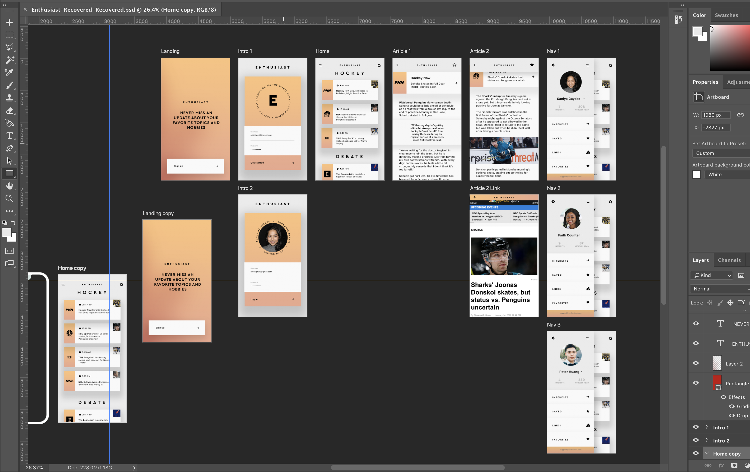
Scroll through the screens
No 3 Intent
Design Priorities
- Consistent navigation and architecture for speed and ease of use
- Traditional usability of a home feed and left-justified profile
- Accessible actions complement predicted steps
Usability
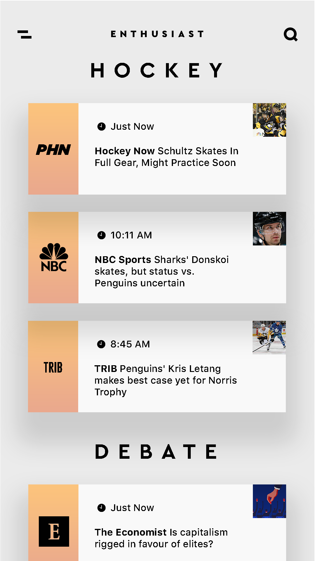
- Factors of usability are decided by intuition, accessibility, and empathy. Enthusiast follows a traditional structure of nesting pages and prioritizes familiarity over disruption for maximum speed. Users interact the same way they would with prominent feed-based apps for quick on-boarding.
No 4 The Process
My Decision Making
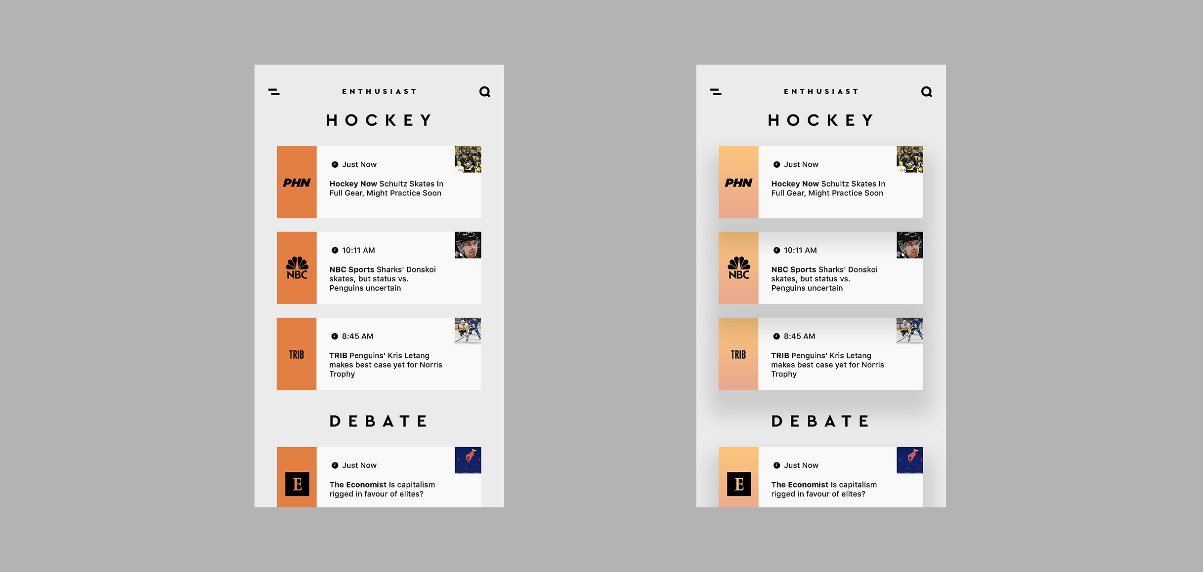
When my favorite hockey player got a concussion in 2016, I wanted a way to get the latest buzz as soon as it was published. I started a bit unconventionally by creating a sample screen of my vision. Enthusiast isn't designed to highlight its own services as a creative app. Instead it serves as a middle man between users and news articles, so the design needed to reflect the user's desire to receive information quickly and easily. I made the visuals of the app as straightforward as possible and avoided slowing the user down with unnecessary transitions and unfamiliar architecture. The UI follows convention to prioritize this ease of use, and the UX follows this as well.
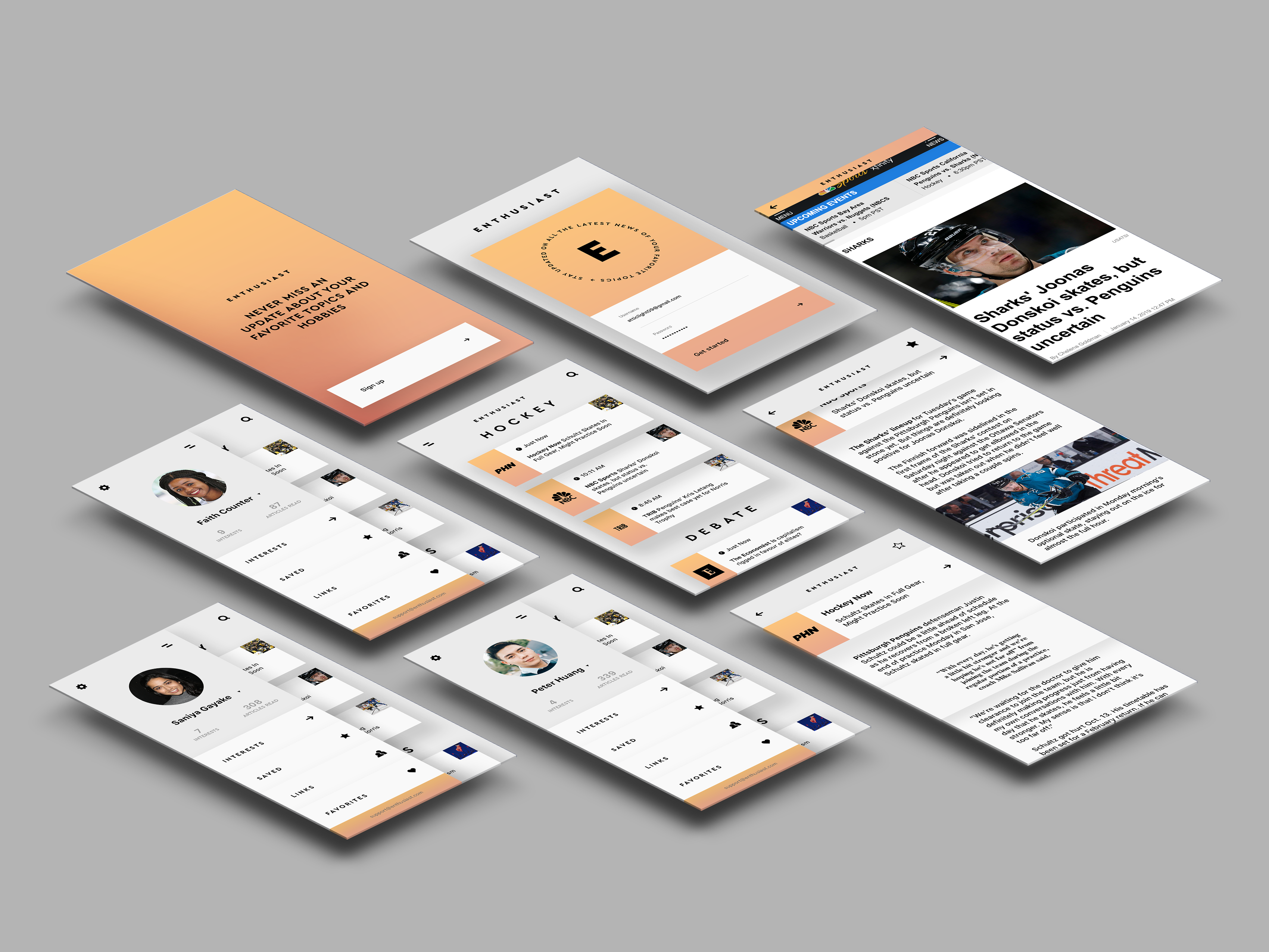
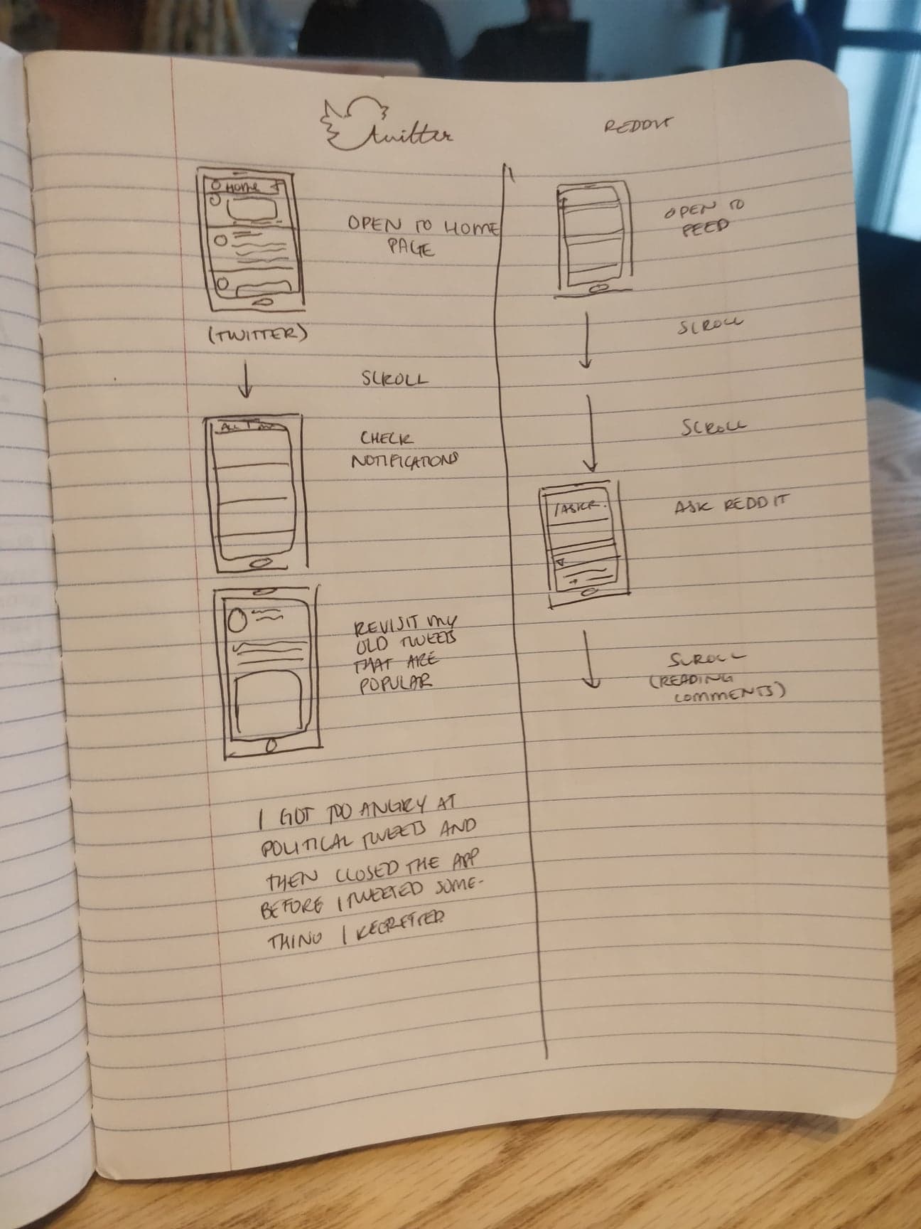
Because we are so familiar with the architecture of mainstream apps, for an app to be intuitive it needs to follow the convention of what people already know. With this design, it was safer to learn from established feed-based apps than to completely disrupt conventional wireframes. Also, because the function of Enthusiast's news feed is already a familiar concept, a redesigned flow would be counterintuitive to a new user.
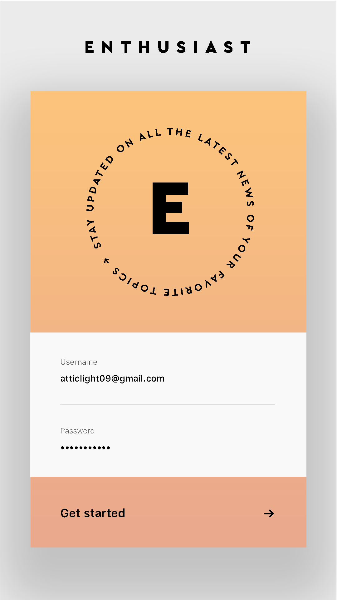
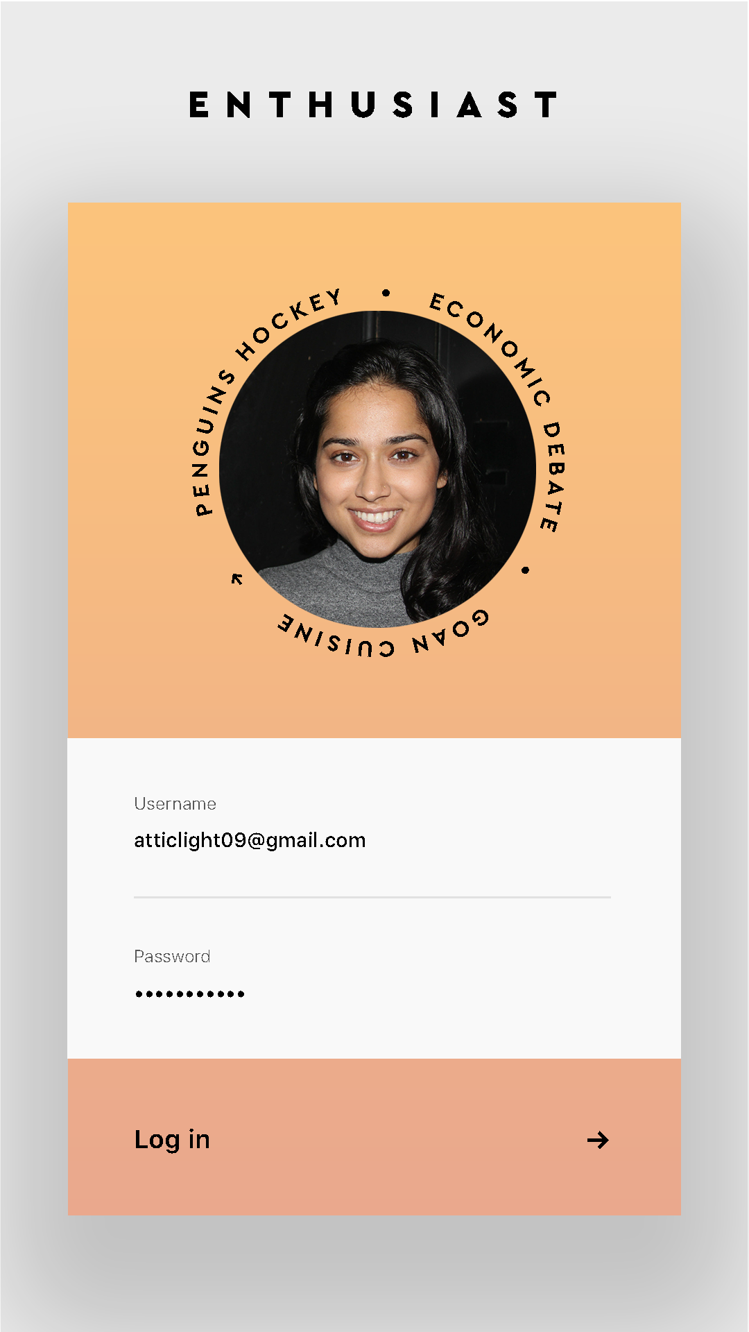
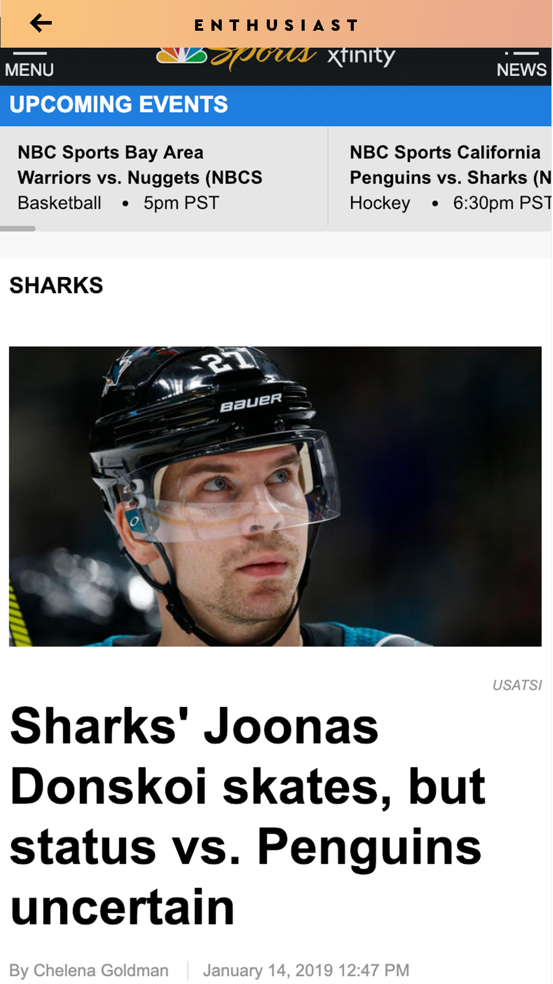
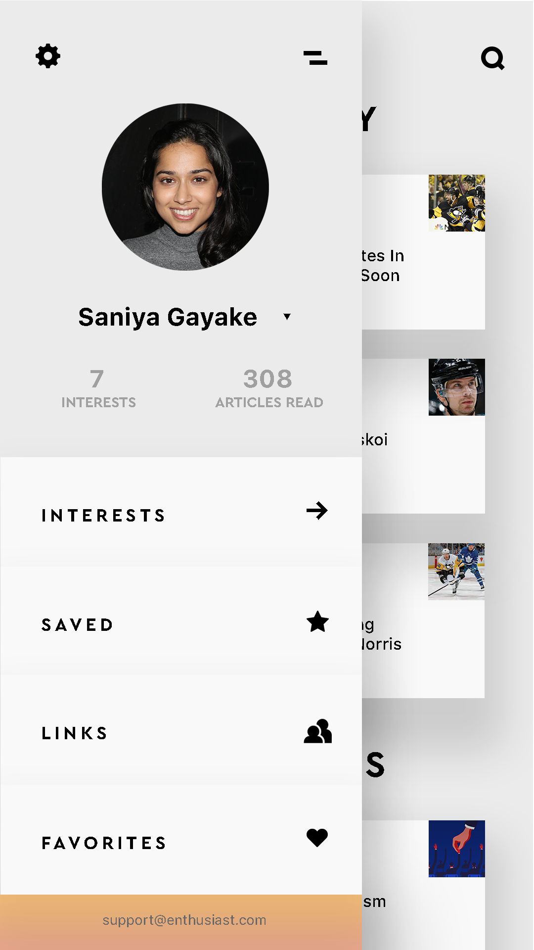
I consulted some other designers to ask their opinions on the UX and eficiency of the app. Most agreed that keeping the app simple was an appropriate trade for enhanced usability. I was concerned that it lacked creativity, but one reminded me of the practice of form follows function, and that if the goal was to connect users to variously sourced articles then the UX accomplished that. He also told me that the UI could be manipulated to show more personality if I still felt it was lacking, so I experimented with gradients and drop shadows, and added the circle of a user's interests around their profile photo. Another reviewer suggested a way to see similar articles by the same news source, but not necessarily on the same topic so I added an internal page with an article on the source's website. This would introduce users to related articles determined by the source, and fully completed the link between user and publisher as well.
