Two Cents Website
No 1 About
Web research, design, and development.
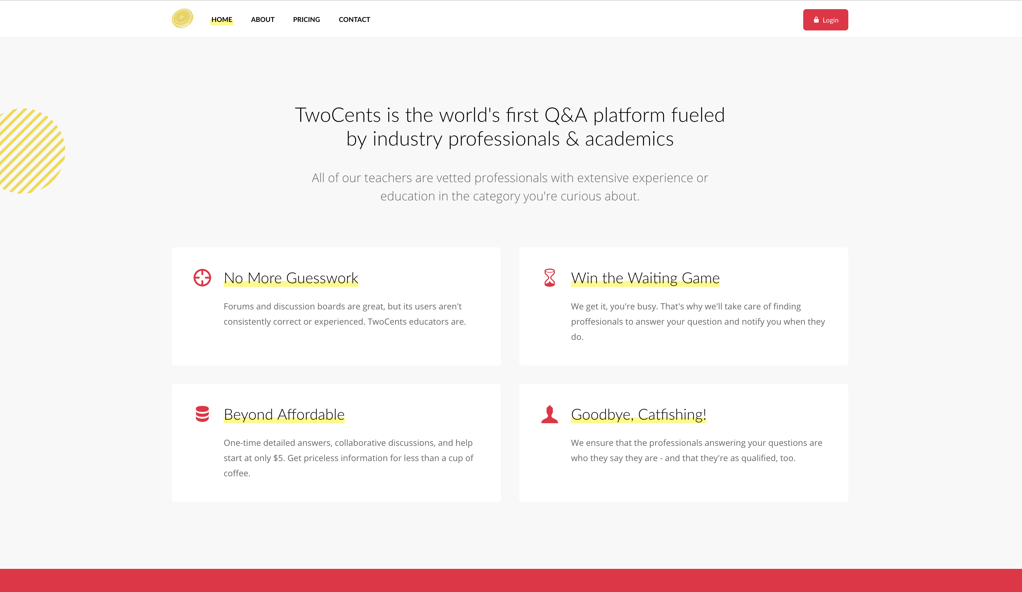
This was the final project of a back end web development class I took last semester. My team created a site that connected people seeking detailed answers to technical questions that are then routed to verified academics and industry professionals. We conducted three rounds of user research and scripted both the front end and the back end.

No 2 Intent
Problem
- We were tasked with creating a website that stored user information in a database and allowed future interaction. We needed to conduct multiple levels of user research as well.
Design Priorities
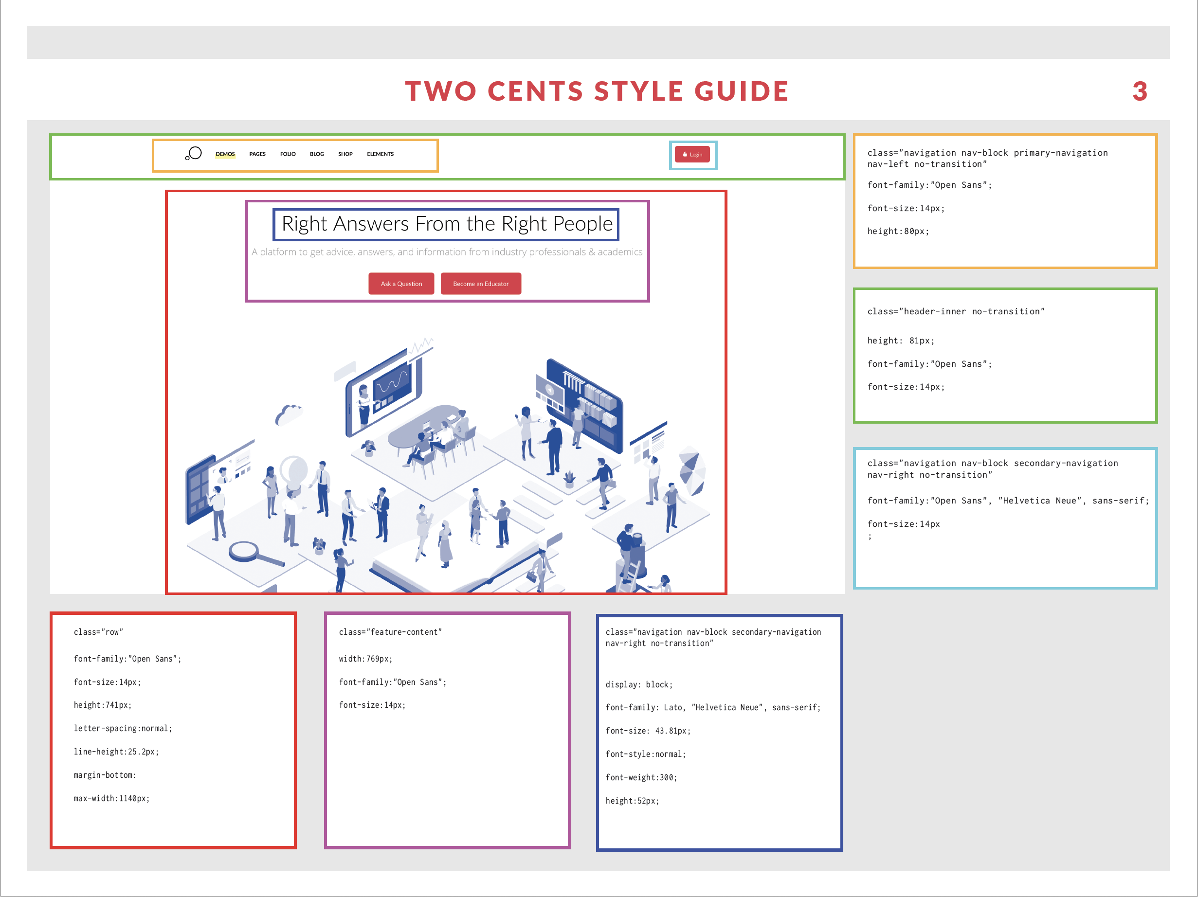
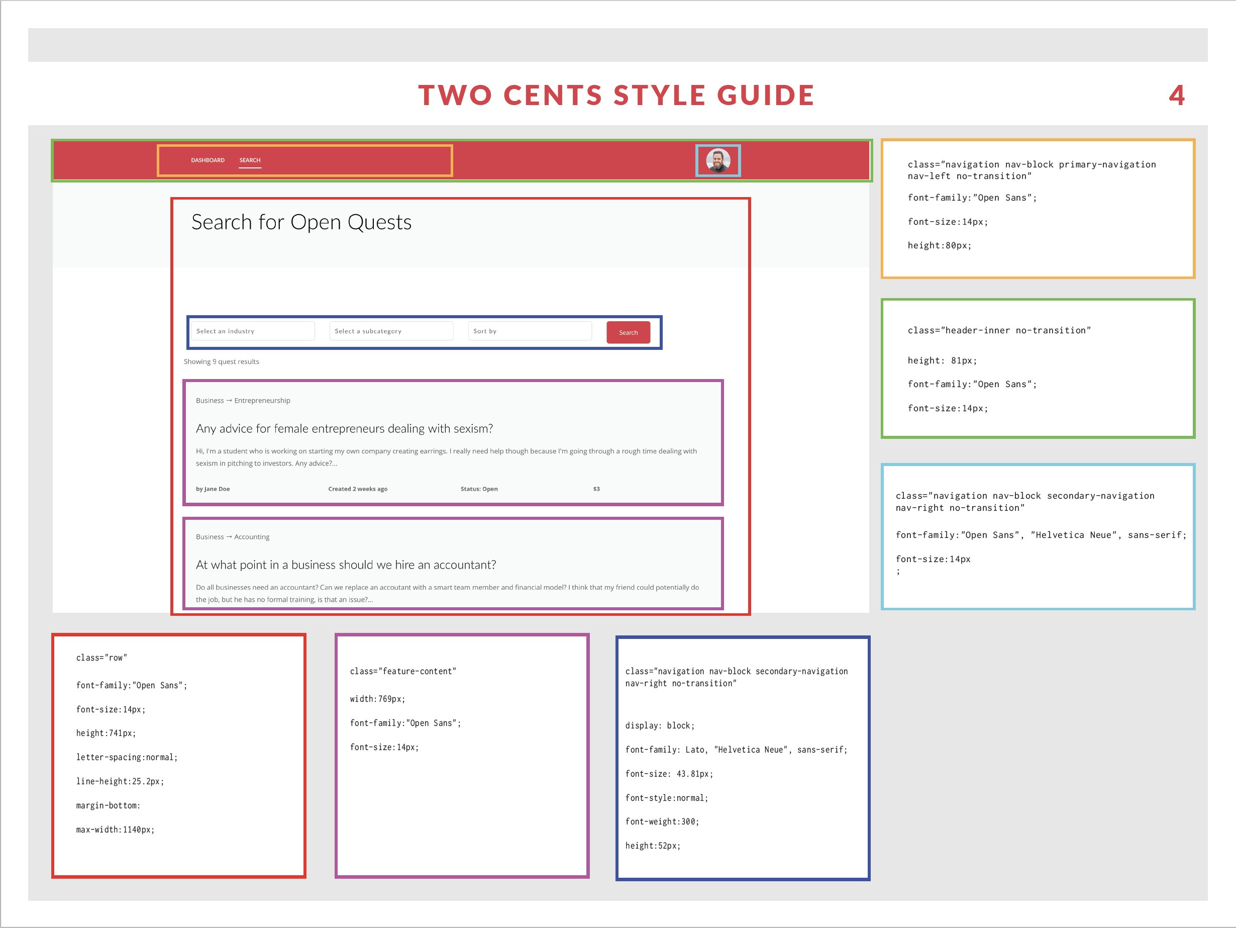
- Parallel structure across the ask and answer sections of the site
- Perpetual navigation and access to profile details on every page
Tools Used
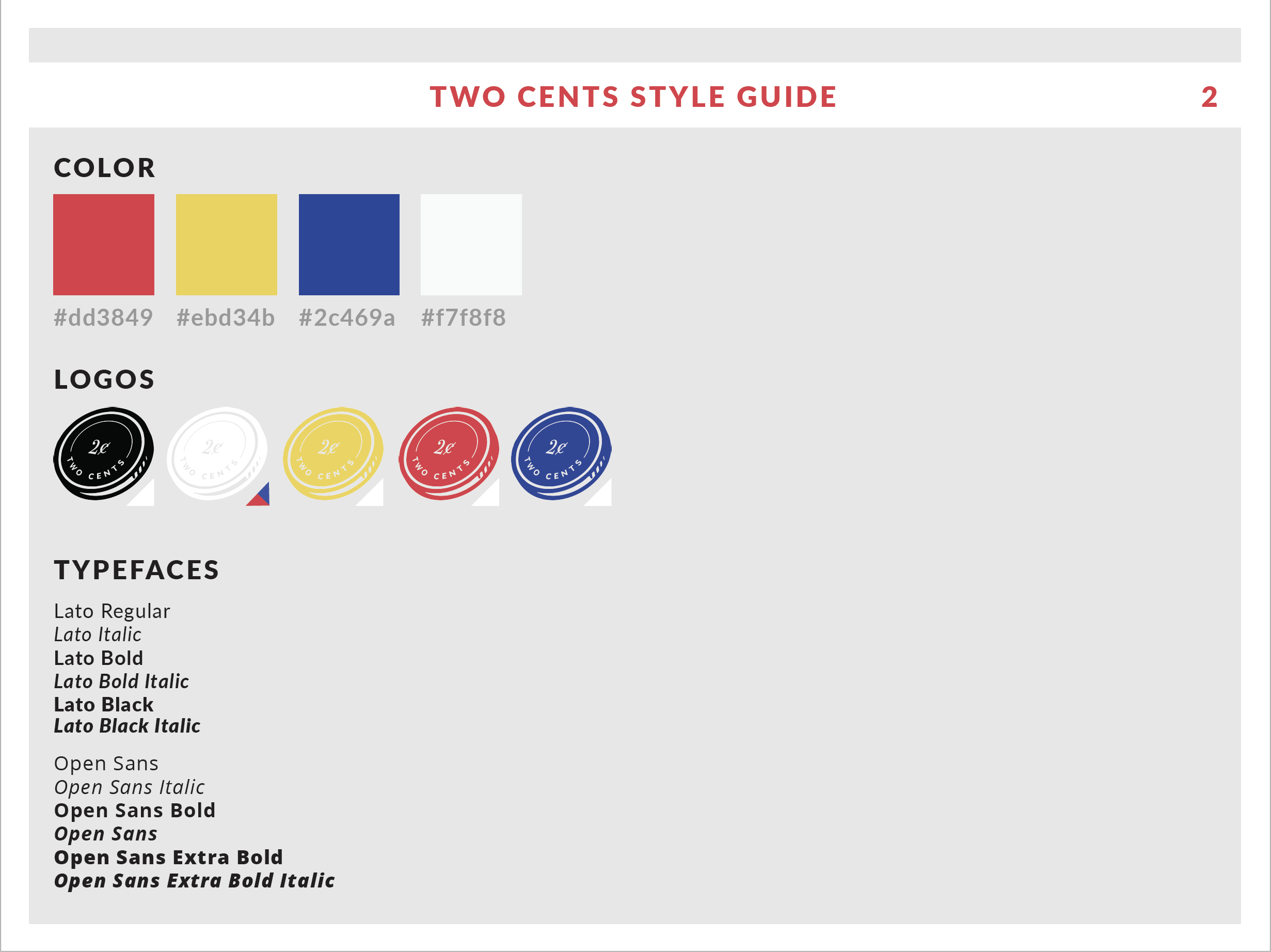
- We created mockups in Adobe Photoshop and Illustrator. We coded the site in HTML, CSS, PHP, and SQL. We used Google Forms for user feedback and Google analytics for user data.
No 3 The Process
Testing and Design
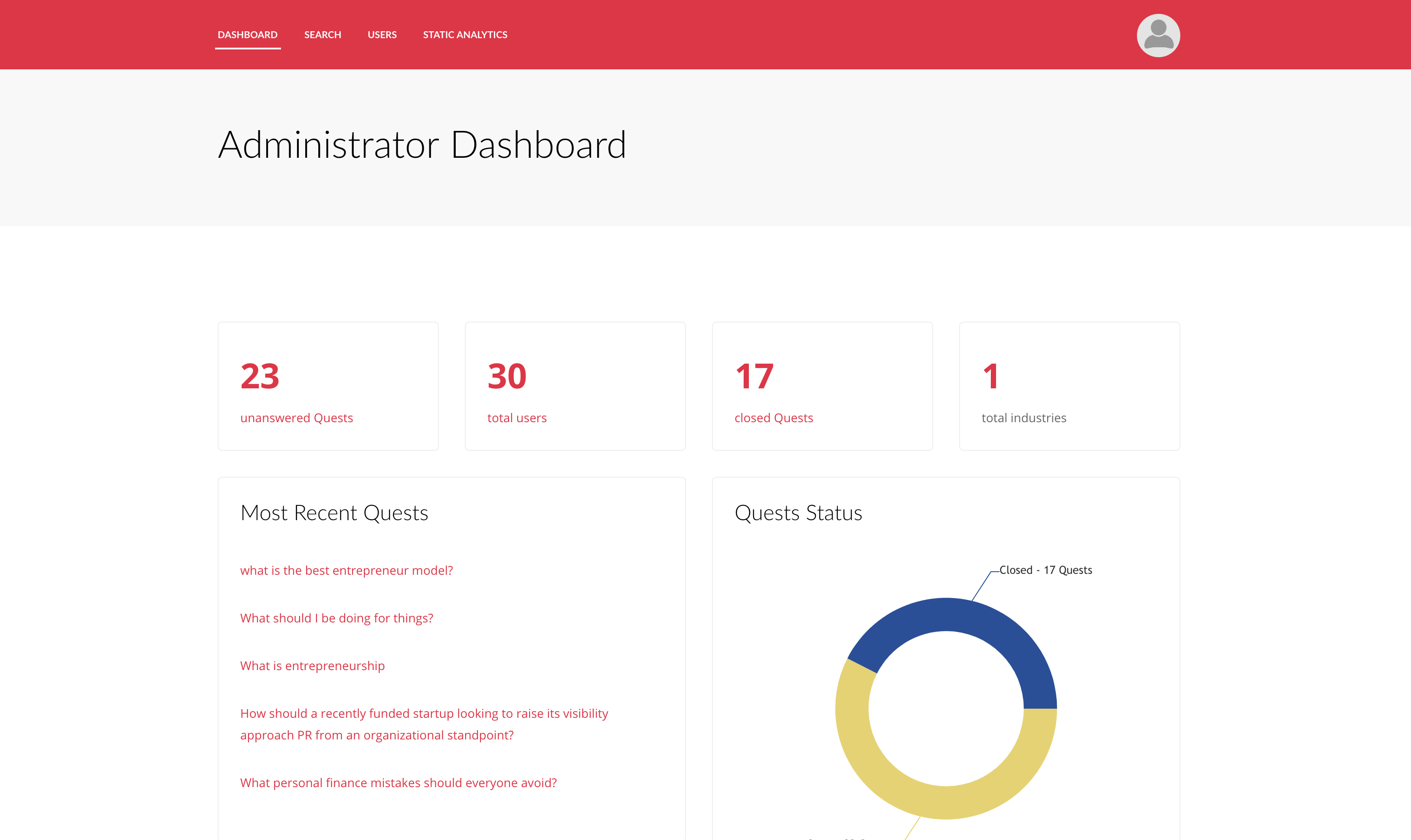
For this project, I was the front end designer on a team with a back end developer and a research manager. Our design milestones for this project were user research, design prototypes, user feedback, iteration, heuristic feedback, and final presentations. Our initial user research gave us a proof of concept, then we created a working version in our first sprint, but the user feedback and data is what shaped our final iterations. We wanted to gather both attitudinal and behavioral data, so we started with usability tests and found that parts of the site, like connecting with friends were going unused. We also presented them with three iterations of the design and learned that most users preferred the sorting of askers and educators on the landing page. We tracked the number of new users, the number of returning users, and amount of time spent on home feed.
The data showed that many new users would ask a question but never log back on to view the answer. Users who received longer answers were more likely to ask another unrelated question immediately after receiving an answer. This user information led to us focusing on the most used parts of the app, notifying users through email when their questions were answered, and placing icon commands at the bottom of answered questions to give users a direct link to the question drafting page, prompting them to ask another question.
